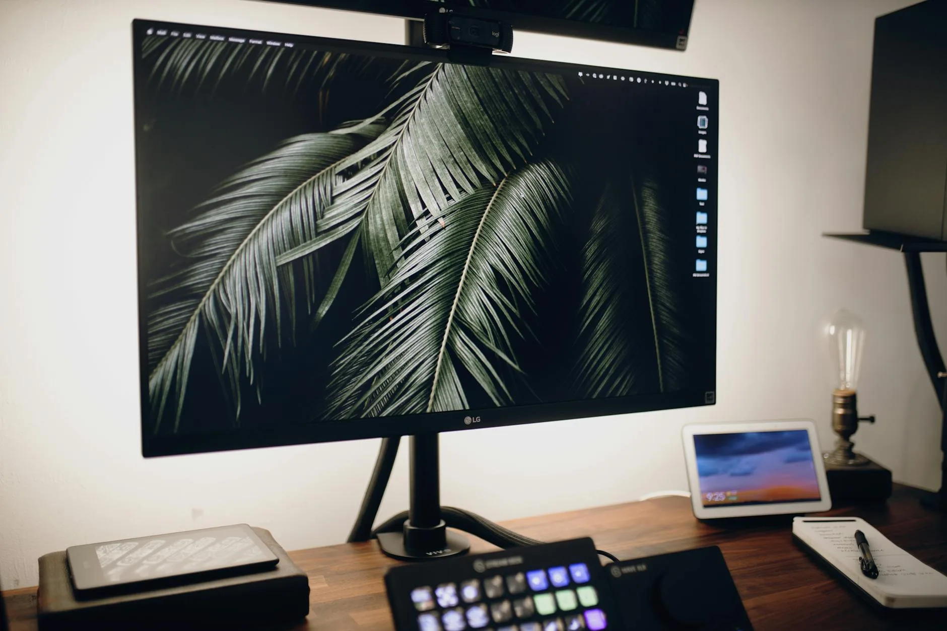
You’ve just plugged in a new monitor, the factory settings have brightness cranked to 100 and contrast somewhere around 75, and after half an hour of spreadsheets your eyes feel like they’ve been sandpapered. Or worse — you’ve been using the same monitor for two years, adjusting nothing, wondering why photos never quite match how they look on your phone. Almost every monitor ships with settings tuned to sell units under the harsh lights of a Currys showroom, not to work in a spare bedroom in Reading at 9pm. Dialling in the right brightness and contrast takes about ten minutes and transforms how a screen feels to use.
This guide walks through what these settings actually control, what numbers to aim for in a typical UK home office, and how to get there on any monitor — budget Dell from Argos, mid-range LG from John Lewis, or premium Samsung OLED from Currys. The target keyword for anyone searching monitor brightness contrast settings is simple: get your screen comfortable, accurate, and easy on your eyes for however long you’re sat in front of it.
In This Article
- Why Monitor Brightness and Contrast Matter
- What Brightness Actually Controls
- What Contrast Actually Controls
- The Right Brightness for Your Room
- How to Set Contrast the Right Way
- Colour Temperature and Blue Light
- Gamma and Black Level
- Recommended Settings by Use Case
- Common Mistakes to Avoid
- Quick Reference: Where to Find These Settings
- Frequently Asked Questions
Why Monitor Brightness and Contrast Matter
Brightness and contrast aren’t just aesthetic choices. They determine how much strain your eyes take over an eight-hour working day, how accurately colours appear for photo and design work, and how long your monitor’s panel lasts before backlight bleed and image retention start showing. Get them wrong and you’ll rub your eyes by 3pm. Get them right and you’ll forget the monitor is there — which is the whole point.
The Eye Strain Angle
The biggest reason to care about these settings is prolonged screen use. The Health and Safety Executive’s guidance on working with display screen equipment makes this explicit: employers have legal duties to reduce the health risks of DSE work, and screen brightness mismatched to ambient light is one of the most common triggers of visual fatigue. I’ve been running monitors day-in-day-out for the better part of a decade, and the single biggest improvement to my working life was dropping brightness from the factory default to something reasonable.
The Colour Accuracy Angle
If you do any work where colour matters — photo editing, design, video, even just wanting holiday snaps to look right — contrast affects how tonal detail is preserved. Push it too high and highlights clip to pure white, losing texture in clouds or skin. Too low and the image looks flat and washed out. Most UK buyers care about this more than they realise; the first thing anyone says when they upgrade from a cheap TN panel to a decent IPS is “the colours are different” — and that’s contrast and black levels working properly.
The Longevity Angle
Monitors running at maximum brightness all day age faster. LCD backlights dim over time, OLED panels risk image retention, and the heat generated at full tilt shortens the life of capacitors in the power supply. A monitor set to 60 brightness will comfortably outlast the same model running at 100.
What Brightness Actually Controls
Brightness adjusts how much light the backlight (on LCD monitors) or how hard the pixels (on OLED monitors) output. It’s measured in candelas per square metre — cd/m², usually called “nits.” Most monitors can hit 250 to 400 nits; premium HDR displays go to 1,000 or more. Your factory default is almost always 250-300 nits out of the box, which is far too bright for most indoor spaces.
The Simple Rule
Your monitor should look about as bright as a sheet of white printer paper held next to it under the same lighting. Open a blank Word document or a plain white webpage, then hold a piece of A4 up next to the screen. If the screen is noticeably brighter, turn it down. If the paper looks clearly brighter, turn it up. Done.
Common Misconceptions
People confuse brightness with sharpness. A dim monitor can feel “muddy” and the temptation is to crank brightness to compensate — but the real fix is usually contrast or gamma, not brightness. Another common error is matching the monitor’s brightness to your phone’s brightness. Phones are viewed from 30cm in variable lighting; a monitor is viewed from 60-70cm under stable lighting. Different rules apply.
What Contrast Actually Controls
Contrast is the difference between the brightest white and the darkest black your monitor can display. A higher contrast value doesn’t mean “better picture” — it means the gap between white and black is wider, which can crush shadow detail and blow out highlights if pushed too far.
Static vs Dynamic Contrast
The number printed on the box is usually static contrast — the measured ratio under fixed conditions. A decent IPS panel sits around 1,000:1. VA panels can hit 3,000:1. OLED panels are essentially infinite because black pixels are fully off. Dynamic contrast is a marketing figure measured with the backlight pumping up and down between frames; ignore it. If you’re comparing panel technologies and what these numbers mean in practice, our rundown of panel types explained: IPS vs VA vs TN covers the differences in plain English.
Where the Contrast Slider Comes In
The contrast slider in your monitor’s menu doesn’t change the panel’s inherent contrast ratio — that’s fixed by the hardware. It changes where the “white” ceiling sits. At 100, every light shade gets pushed toward pure white, clipping detail. At 50, nothing clips but mid-tones can look murky. The sweet spot for most panels is between 70 and 80, which is where I’ve landed on every monitor I’ve owned for the last five years. If you are exploring this area, our guide on Monitor Size Guide: What Size Do You Need for Your Desk? covers the essentials.
The Right Brightness for Your Room
Setting brightness is context-dependent. Your office at 9am with sunlight streaming through the window needs different settings than the same office at 10pm with only a desk lamp on. The goal is to match the monitor’s output to your ambient light, not to fight against it.
- Turn on the lights you actually use while working. Don’t calibrate in the dark if you normally work with the overhead light on. Match real conditions.
- Open a pure white image or blank document. A new Google Doc works. So does navigating to about:blank in your browser.
- Hold a sheet of A4 printer paper next to the screen. The paper is your reference point for “this is what white looks like in this lighting.”
- Adjust brightness until the screen roughly matches the paper. Most UK home offices land between 25 and 50 on the brightness slider. Showroom floor settings of 80-100 are too bright for any real workspace.
- Step back and look at the whole screen. Your eyes should feel relaxed, not like they’re squinting.
- Re-check at different times of day. If the room is much brighter at midday than in the evening, consider bumping brightness slightly during daylight hours. Many newer monitors have auto-brightness sensors that handle this — turn them on if yours does.
What About HDR Content?
HDR is the exception. When you’re watching HDR video or playing HDR games, brightness needs to go up — typically to 80-100 — because HDR content is mastered for much higher peak luminance. The trick is to only use high brightness in HDR mode, then drop back to your normal level for desktop work. Most Windows 11 and macOS setups handle this automatically when HDR is toggled.
How to Set Contrast the Right Way
Contrast is easier to set than brightness because you can use a test image rather than eyeballing ambient light. The standard tool is a greyscale gradient — a strip running from pure black to pure white in even steps. If every step is distinguishable, contrast is set well. If the dark steps blur together, contrast is too low. If the light steps merge into white, it’s too high.
- Load a greyscale test image. Search for “monitor contrast test image” or use one of the free tools at Lagom LCD test (lagom.nl/lcd-test/). These are the industry standard reference patterns.
- Start with contrast at 75. This is the default sweet spot for most IPS and VA panels. OLEDs often need slightly less — around 65-70.
- Look at the darkest three blocks. They should be visibly different from each other and from pure black. If they’re indistinguishable, nudge contrast down a few points or raise brightness very slightly.
- Look at the brightest three blocks. Same test in reverse — each should be distinguishable. If they’ve merged into a single “white” block, drop contrast by 5 and retest.
- Check skin tones on a portrait photo. Cheeks and foreheads are the first places you’ll notice clipping. If faces look blown out, contrast is too high.
- Leave it for an hour, then reassess. Your eyes adapt. What feels right immediately after adjustment often needs a small tweak when you come back to it.
If Your Monitor Has sRGB or Picture Modes
Many monitors ship with preset picture modes (sRGB, DCI-P3, Gaming, Movie, Standard). Some of these lock the contrast slider. If so, either pick the mode that suits your use and trust the factory calibration, or switch to “User” or “Custom” mode and calibrate manually. For most office work, sRGB or Standard is the right choice — Gaming and Movie modes tend to over-saturate and crush blacks.
Colour Temperature and Blue Light
Colour temperature changes the overall warmth of the image, measured in kelvin. 6,500K is the sRGB standard and looks broadly neutral. Lower values (5,500K, 4,000K) are warmer — more orange/yellow. Higher values (7,500K, 9,300K) are cooler — bluer. Most factory defaults sit around 9,300K because it looks punchy in a showroom. It’s harsh on your eyes for everyday use.
What to Set
For general office and web work, stick with 6,500K. If your monitor only offers named presets, “Warm” or “Warm 2” is usually closest to 6,500K. “Cool” or “Normal” is often 9,300K and worth avoiding for long sessions.
Blue Light Filters
Blue light filters (sometimes called “Low Blue Light”, “Eye Care Mode”, or “Reading Mode”) shift the whole picture warmer — usually to around 5,500K or lower. Whether blue light actually disrupts sleep is still debated medically, but two things are uncontroversial:
- Warmer colour temperature feels easier on the eyes during long evening sessions, regardless of whether it affects your sleep cycle.
- It ruins colour accuracy — do not use a blue light filter while editing photos, designing, or anything where colour matters.
A practical compromise is Windows Night Light or macOS Night Shift, both of which fade warmth in automatically after sunset and back out at sunrise. That way you get the benefit in the evening without messing up daytime colour work. Refresh rate affects visual fatigue too — higher rates like 120Hz or 144Hz feel noticeably smoother on the eye, and our guide to monitor refresh rates explained covers what to look for.
Gamma and Black Level
Gamma is the one setting most people never touch and most people should. It controls how mid-tones are rendered between black and white. The sRGB standard is 2.2, and almost every monitor should be set to this unless you have a specific reason not to.
Why Gamma Matters
If gamma is off, brightness and contrast adjustments chase their own tail — you keep fiddling and nothing looks right. Too low a gamma (1.8) makes the image look washed out and chalky. Too high (2.4) crushes shadow detail and makes everything look gloomy.
Black Level (Sometimes Called “Black Stabiliser”)
On some gaming monitors you’ll find a Black Level or Black Stabiliser setting. It lifts dark-scene brightness so enemies hiding in shadows are easier to spot. For office and general use, leave it at default (usually 50). Only enable it if you play competitive shooters and care about spotting opponents in dark maps.
Recommended Settings by Use Case
One size doesn’t fit all. Here’s a starting point for common UK home office scenarios, assuming a typical IPS monitor in the £150-500 bracket. Fine-tune from these values.
General Office Work (Spreadsheets, Email, Web)
- Brightness: 25-40 (daytime), 15-25 (evening)
- Contrast: 75
- Colour temperature: 6,500K or “Warm”
- Picture mode: Standard or sRGB
- Blue light filter: Windows Night Light / macOS Night Shift after sunset
Photo and Design Work
- Brightness: 30-50 (calibrate against a print if possible)
- Contrast: 75-80
- Colour temperature: 6,500K exactly
- Picture mode: sRGB or AdobeRGB (depending on workflow)
- Blue light filter: Off — it destroys colour accuracy
Gaming (SDR)
- Brightness: 40-60
- Contrast: 75-80
- Colour temperature: 6,500K-7,500K (cooler can feel more vivid for games)
- Picture mode: Gaming or FPS, or Custom with Black Stabiliser nudged up slightly
Video and Streaming
- Brightness: 30-50 (SDR), 80-100 (HDR)
- Contrast: 75
- Colour temperature: 6,500K
- Picture mode: Movie or Cinema
CAD, Programming, Long Text Sessions
- Brightness: 20-35 — lower helps with the hours-long stare
- Contrast: 70-75
- Colour temperature: “Warm” preset, or 5,500-6,000K
- Picture mode: Reading Mode or Custom
Common Mistakes to Avoid
A few patterns come up again and again when I’m helping friends sort out their setups. These are worth flagging up front so you don’t waste a weekend chasing your tail.
- Leaving factory defaults. Every monitor ships tuned for a showroom. The first thing you should do with a new panel is turn brightness down.
- Setting brightness in the dark. If you calibrate at 11pm with no lights on, it’ll be blinding at 9am when sunlight comes in. Calibrate in working conditions.
- Using Vivid or Dynamic modes. These over-saturate colours and crush blacks to look impressive on a shop floor. They’re miserable for extended use.
- Cranking contrast to 100. This clips highlights and destroys detail in bright areas. 75 is almost always better.
- Ignoring colour temperature. Factory defaults are usually far too cool (blue). 6,500K is the correct neutral.
- Running blue light filter 24/7. Fine for evening relaxation, terrible for anything where colour matters.
- Not re-checking after a season change. The amount of daylight in a UK home office in December vs June is wildly different. Tweak settings twice a year.
The 20-20-20 Rule
Beyond brightness and contrast, eye strain is also about breaks. The HSE’s leaflet on working with display screen equipment safely recommends short regular breaks from looking at the screen. The practical version most opticians in the UK quote is 20-20-20: every 20 minutes, look at something 20 feet away for 20 seconds. Combined with good brightness calibration, it’s the single cheapest way to reduce end-of-day fatigue. If you’re also thinking about posture and chair height, our ergonomic home office guide pairs well with monitor calibration.
Quick Reference: Where to Find These Settings
Every manufacturer buries the menu somewhere different. Most monitors use a joystick or a row of buttons on the back or underside of the panel. If you can’t find the on-screen menu, check the manual that came with the monitor — or search the model number on the manufacturer’s website, where PDFs are usually available.
Common UK Monitor Menus
- Dell: Menu button, then Picture > Brightness/Contrast. Preset modes under Preset Modes.
- LG: Joystick click to open Quick Menu, Settings > Picture Mode > Brightness, Contrast, Color Temperature.
- Samsung: Joystick on back, Menu > Picture > Brightness/Contrast. Eye Care modes under Game Mode settings on gaming panels.
- BenQ: Button row or Hotkey puck, Menu > Picture > Brightness/Contrast/Gamma. Eye-Care mode toggle usually its own quick button.
- AOC: Joystick click, Luminance > Brightness/Contrast/Gamma. Color Setup > Color Temp.
- Philips: Button row under the bezel, Picture > Brightness/Contrast. SmartImage presets.
- Iiyama: Button row, Picture Adjust > Brightness/Contrast.
Software-Side Tools
You can also calibrate using software, which saves the profile at the operating system level rather than on the monitor itself.
- Windows: Settings > System > Display > Color Management, or search for “Calibrate display colour” — walks you through gamma, brightness, and contrast with test patterns.
- macOS: System Settings > Displays > Colour Profile > Customise > Calibrate.
- Colorimeter hardware: A hardware calibrator like a Datacolor SpyderX (about £150 from Wex Photo Video or Amazon UK) is overkill for office use but worth it for serious photo and video work. It measures the actual output and generates a corrected profile automatically.
If you’re kitting out a new desk from scratch and want to think about the whole setup rather than just the monitor, our guide to the best standing desks in 2026 covers the foundation everything else sits on.
Frequently Asked Questions
What is the ideal brightness for a monitor? For a typical UK home office with standard indoor lighting, 25-40 on the brightness slider is about right — roughly 100-150 nits. Match it to the brightness of a sheet of white paper held next to the screen. Turn it down further in the evening, and slightly up during bright daylight.
What contrast setting should I use on my monitor? 75 is the sweet spot for most IPS and VA panels. OLED monitors often work best slightly lower, around 65-70. Test with a greyscale gradient — every step between black and white should be distinguishable, with no crushed shadows or blown-out highlights.
Is high brightness bad for your eyes? Running a monitor brighter than your surrounding environment forces your pupils to contract and expand constantly, which is a major cause of eye strain over long sessions. The HSE’s display screen equipment guidance advises matching screen brightness to ambient light and taking regular breaks to reduce this risk.
Should I use my monitor’s blue light filter all day? No. Blue light filters shift everything warmer, which ruins colour accuracy for photo editing, design, and any visual work. Use Windows Night Light or macOS Night Shift, which fade in automatically after sunset. Leave the filter off for daytime colour-critical work.
What colour temperature should I set my monitor to? 6,500K is the sRGB standard and the correct neutral for almost everyone. If your monitor only offers named presets, “Warm” is usually closest. Avoid “Cool” or the default “Normal” — they sit around 9,300K which is harsh for extended use.
Why do my photos look different on my monitor vs my phone? Because neither is calibrated to a reference standard. Phones boost saturation and brightness aggressively to look punchy in daylight. Monitors ship with over-bright, over-cool factory defaults. Calibrate both to 6,500K and contrast to around 75, and they’ll look much closer to each other — and much closer to how the image looks in print.
How often should I recalibrate my monitor? For general use, once a year and after any big change to your room’s lighting (new lamp, moved desk, seasonal daylight shift). For professional colour work, every 2-4 weeks with a hardware colorimeter. LCD backlights drift over time, so older monitors drift further from their original calibration than newer ones.